Pie Chart Worksheet Template
ADVERTISEMENT
 1
1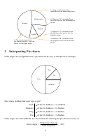 2
2 3
3Pie charts (7)
Contents
1 Drawing a pie chart
1
2 Interpreting Pie charts
2
Introduction
A pie chart is a very useful, visual way of displaying data. The sectors in the pie give a
reasonably clear indication of the size of each grouping in the data. Do not use a pie chart if
your data has too many groups since there will be too many sectors and so it will not give a
quality impression of the data.
1 Drawing a pie chart
We find the angle needed for each sector of the pie chart using this formula:
Frequency of group
Sector angle =
360
Total frequency
Example. Draw a pie chart to show the amount of time Flora spent completing the homework
for 4 different subjects on one evening:
Subject
Time (minutes)
Mathematics
25
English
15
French
10
History
45
The total amount of time for all homework is 25 + 15 + 10 + 45 = 95 minutes. We can now
find the angle for each sector in the pie chart:
Subject
Time (minutes)
Sector angle
25
Mathematics
25
360 = 94 736
95
95
15
English
15
360 = 56 842
57
95
10
360 = 37 894
38
French
10
95
45
History
45
360 = 170 526
171
95
Notice that 95 + 57 + 38 + 171 = 361. The angles do not quite add up to 360 since we rounded
each value to the nearest degree.
Now we can draw the pie chart:
1
ADVERTISEMENT
0 votes
Related Articles
Related forms


Related Categories
Parent category: Education