Your Pie Chart Analysis Worksheet Template
ADVERTISEMENT
Your Pie Chart Analysis
The eight applicant categories can be approximately quantified in percentages that vary from one institution to
another. One college may enroll 20 percent alumni children in its classes, and another only 15 percent. An Eastern
college may enroll 75 percent of its students from east of the Mississippi; a southern college may enroll 50 percent
of its students from below the Mason-Dixon Line. One college could have a student body that is 40 percent stu-
dents of color, while another might enroll only 10 percent minority students.
These percentages provide you with a means for estimating the intensity of your competition for admission at dif-
ferent selective colleges—all of them, as you know now, determined to construct a diverse student body. You can
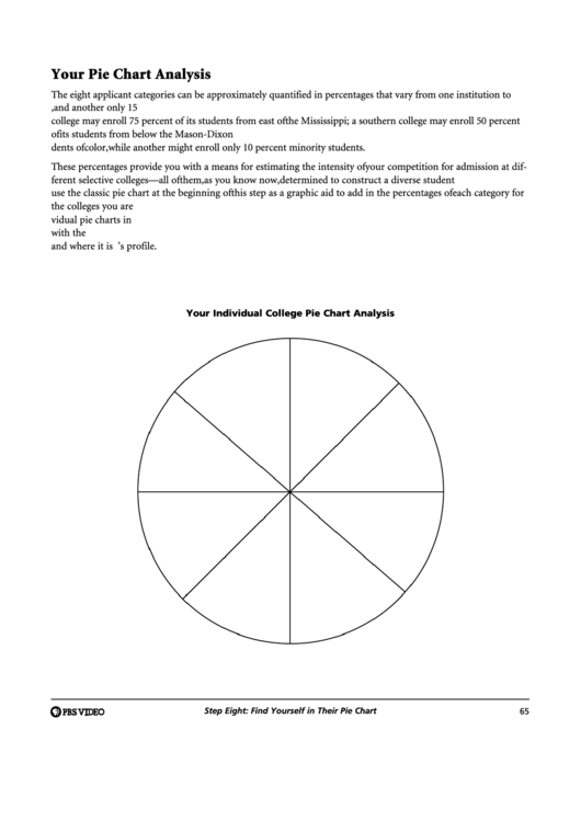
use the classic pie chart at the beginning of this step as a graphic aid to add in the percentages of each category for
the colleges you are considering. You can convert data from the first-year profiles issued by the colleges into indi-
vidual pie charts in order. You can then locate your own place in those charts to understand how you compare
with the competition. You will be able to see from the data or size of the pie slices where the competition is great
and where it is moderate. Below is a blank pie chart to get you started on filling out an individual college’s profile.
Your Individual College Pie Chart Analysis
Step Eight: Find Yourself in Their Pie Chart
65
ADVERTISEMENT
0 votes
Related Articles
Related forms
Related Categories
Parent category: Education
 1
1 2
2