Pie Chart Worksheet Template
ADVERTISEMENT
S T U D E N T P A G E
T A B L E S , G R A P H S , A N D C H A R T S
How to Make a Pie Chart
Name: ________________________________________________________
Date: _____________
Use a pie chart to show numbers expressed as a percentage of a whole. A pie
chart is a circle divided into wedges the shape of pizza slices. The circle represents
100 percent. The wedges represent data that are percentages of a whole. Suppose
you took a poll at a movie theater asking 100 moviegoers which type of movie they
prefer: comedy, drama, or horror. The number of moviegoers you surveyed
represents 100 percent. And each type of movie, as selected by the percentage of
moviegoers, represents a different wedge of the pie chart. Here are the steps to
making a pie chart:
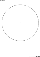
1. Draw a circle with a compass.
2. Give your pie chart a title that describes your variables (“Type of
Movie That Moviegoers Prefer”).
3. Mark the center with a point; this is where each pie wedge will start.
4. Measure a wedge for each independent variable (Drama, Comedy,
or Horror). First, convert your data from percentages to angle degrees.
For example, if 25% of moviegoers prefer dramas, the pie wedge for
dramas would be 25% of the 360-degree circle, or 90 degrees. Then,
position a protractor at the center point of the circle. Mark 0-degree
and 90-degree angles with points on the edge of the circle. Draw a
line from these points to the center of the circle.
5. Label the wedge (include its percentage).
6. Measure your next wedge from the edge of the first. When you are
o
finished, the entire circle should be filled in and add up to 360
. The
percentages should add up to 100%.
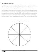
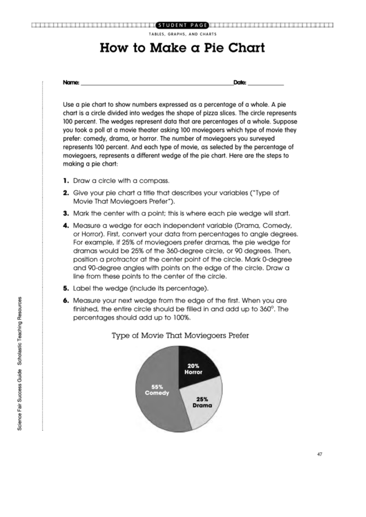
Type of Movie That Moviegoers Prefer
20%
Horror
55%
Comedy
25%
Drama
47
ADVERTISEMENT
0 votes
Related Articles
Related forms
Related Categories
Parent category: Education
 1
1