Resume And Cover Letter Templates Page 6
ADVERTISEMENT
 1
1 2
2 3
3 4
4 5
5 6
6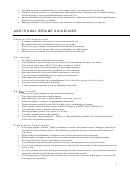 7
7 8
8 9
9 10
10 11
11 12
12 13
13 14
14 15
15 16
16 17
17 18
18 19
19 20
20 21
21 22
22 23
23Font
Use a 10-12 point font in the body of the resume, and 12-16 point font for section headings.
Use a 12-20 point font for your letterhead (name and contact information at the top of the resume). Have
your name stand out, but avoid choosing a font size that is more than 2 sizes larger than your letterhead
font.
Use fonts that are easier to read, such as Garamond, Book Antiqua, Times New Roman, Arial, and
Helvetica. Avoid fonts with unusual spacing between letters, shadowing or unusual letter shaping, such as
Brush Script
ALGERIAN, Bernard MT, and
.
MAKING SURE YOUR RESUME IS ERROR FREE
It’s always a good idea to have someone else look over your resume. After you spend hours working on something,
you may not catch spelling errors or questionable grammar, so let Career Services staff, faculty, and/or friends
double-check your work. Don’t place complete trust in computer spell-checks. Misspellings are found quite often
in resumes that have been spell-checked.
Also continue to edit your resume and customize it for particular positions. After each edit or revision, have at least
two other individuals read your resume again to look for grammar, spelling, spacing or design errors.
EDITING YOUR RESUME TO FIT
When You Need More Space To Fit Things On One Page:
Reduce margins (no less than .5 inch margins).
Reduce font sizes (no less than a 10 point font—try to keep your name and section headings at least 12 or
14 point font).
Change font styles (Times New Roman or Arial Narrow are fonts that take up smaller space per character).
Change tabs so the tabbed line starts further left (can be less than 5 spaces over—go to a 3 or 4 space tab).
Put more information on each line (e.g. 1. combine company name, job title, locations and dates on same
line or split into two lines and then use bolds and/or italics to distinguish job title and company name to
have them still stand out; 2. list related courses on one line; 3. list honors on one line; etc.). Try to avoid
putting job descriptions in paragraphs or putting all club involvement on one line (too difficult to read or
make distinguishable).
Decrease the number of line spaces between headings (use only one blank line space instead of two
between each section of the resume—do not take out all blank line spaces; spacing is still important to
make the resume appealing to the eye and easier to read).
Change date or state format so they’re shorter (e.g. use “02/05” vs. “February 2005”; use “WI” vs.
“Wisconsin”, etc.).
Eliminate too detailed information.
Eliminate experiences that are least related or that involved the least amount of responsibility—only if there
is other work experience to list that is more related, shows more responsibility, and/or is more recent.
Redesign your personal letterhead so it takes up less space—put more information per line so fewer line
spaces are used (e.g. list address, city/state/zip, phone number and email all on one line and then use bullet
symbols to separate them so they’re still easy to read). See sample resumes on pages 10-12 in this guide.
When You Need More Content To Fill A Page:
Expand margins (no larger than 1 inch left and right/top and bottom).
Increase font sizes (no larger than 12 point for body of resume; no more than 16 point font for headings; no
larger than 20 point font for name/letterhead).
Change font (Arial or Helvetica are examples of fonts that take up more space per character).
Increase tab spacing (e.g. make tab spacing 6 to 8 spaces apart vs. 5 or fewer spaces).
Put less information per line (e.g. list job title separate from company name, list degree separate from
school name, etc.).
Increase line spacing between headings and items within a section (no more than two blank line spaces
between each section; no more than one blank line space between separate items under a heading/within the
same section; two to three line spaces between your letterhead and the first section heading of the resume)
Change date and state formats to be longer (e.g. “February 2003-March 2004” vs. “02/03-03/04”; use
“Wisconsin” vs. “WI”).
4
ADVERTISEMENT
0 votes
Related Articles
Related forms


Related Categories
Parent category: Business