Pie Chart Worksheet
ADVERTISEMENT
 1
1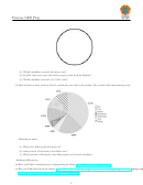 2
2Penrose GED Prep
3.6 Pie Charts
In this worksheet, we will interpret data using pie charts. If you would like further explanation before attempting
these problems, links to video descriptions can be found at the end of this worksheet.
1 The pie chart below gives us information on peoples favorite ice cream flavors.
(a) What are the six ice cream flavors represented in the pie chart?
(b) What percent of people like vanilla the most?
(c) What percent of people like either mint chocolate chip or strawberry the best?
(d) Which flavor is the most popular?
2 Five candidates ran for district judge. Debbie Kruger recieved 20 percent of the votes. Alan Hansen recieved
35 percent of the votes. Kyle Mariner recieved 5 percent of the votes. Jackie Downing recieved 26 percent of
the votes and Matthew Larsson recieved 14 percent of the votes. Organize this information into a pie chart
and then answer the following questions.
1
ADVERTISEMENT
0 votes
Related Articles
Related forms


Related Categories
Parent category: Education