Periodic Trends Lab
ADVERTISEMENT
 1
1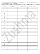 2
2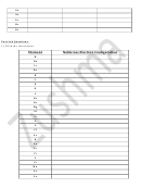 3
3 4
4Lab# ____: Periodic Trends
Name: ____________________________
Date: _____________________________
Periodic Trends Lab
In 1869, aware of the need to organize elements in a meaningful way, Dmitri Mendeleev
developed a classification scheme based upon increasing molar mass. Elements that demonstrated
similar patterns of chemical behavior were placed into one of eight groups. Members of these groups
were displayed in vertical columns of his periodic table. Even though his chart was incomplete,
Mendeleev was able to predict the properties of elements yet to be discovered.
Today’s periodic table accommodates many more elements than Mendeleev’s. Although the
scheme is based upon increasing atomic number, the arrangement of elements within the chart is similar
in organization to the table published by Mendeleev in 1871. Trends in the chemical and physical
properties of elements may be seen as a periodic function of electron configuration. In this exercise you
will examine several properties of elements and observe how these properties may be interpreted with
respect to periodic law.
Procedure:
1) Go to the following webpage:
2) Record the atomic radius, electronegativity, and first ionization energy for each element listed in
Data Table 1 below. (click on the element symbol to find the above information)
3) Once the data is all filled in, open Excel and enter the data.
4) Using Excel plot the following three graphs
a. Atomic number vs. Atomic radius
b. Atomic number vs. Electronegativity
c. Atomic number vs. Ionization energy
5) Print a copy of each graph, cut the graph out and attached into your lab notebook.
How to use Excel:
1) Type the numbers only into a column using an Excel spreadsheet
2) Highlight the numbers only
3) Choose Insert ‐‐‐ Chart
4) Choose XY scatter plot. – Choose the first one‐ points with no lines‐‐‐Click Next
5) Click on the Series Tab and write in the Name of the graph (with units)‐‐‐Click Next
6) Click on the Title tab and enter the labels for the x and y axis
7) Click on the Legend tab and turn the legend off.
8) Click on the Gridlines tab and turn off the major gridlines
9) Click Next and Insert chart as object in New Sheet
10) Click Finish
11) Once your Graph is on a new sheet, right click on your graph and Click on Format Plot area
12) On the left, under area, turn the color to white and hit okay.
ADVERTISEMENT
0 votes
Related Articles
Related forms


Related Categories
Parent category: Education