The Musician'S Resume Handbook Page 17
ADVERTISEMENT
REPRODUCTION OF RÉSUMÉS
By the time you’re ready to reproduce your résumé, you have no doubt expended a great deal of
effort. Don’t allow all that good work to go to waste by taking shortcuts at the final stage. Your
résumé should look as professional as it reads. So, use professional materials and printing
techniques.
Printing
Today, most people are familiar with word processing. If you are not, now would be an excellent
time to learn. Word processing makes revision much faster than typing and allows you to use
quality laser printing for your final copy. Using a laser printer will greatly enhance the look of
your résumé.
Locations for Laser-printing
Rush Rhees Library – Computer and Reserve Library (CARL) located next to Reserve Reading
Room in back of library
Humanities Writing Center – Morey 100, River Campus
Eastman – Eastman Living Center Computer Lab
Kinko’s Copies – 335 East Avenue
1667 Mount Hope Avenue
Phone: 262-2679
Phone: 271-2130
Kinko’s Copies also offers typing and copying services.
Other Typing/Copying Services
You might want to hire an experienced typist to type your résumé. Check advertisements in
newspapers and on bulletin boards. The Careers and Professional Development Office often
receives notice of such services.
Do not use a public photocopier such as those in libraries and institutional duplicating centers, as
they often leave distracting smudges and provide uneven quality.
Fonts
Whether you type your document yourself or have someone else do it, make sure that the printing
fonts are easy to read. They should be around 12pt in size. You don’t want to make your reader
squint to read too-small print 9readers with less than 20-20 vision may not appreciate the
reminder that their vision isn’t what it used to be). You als want to avoid too-large print, which
looks elementary and seems to be striving to fill space.
Similarly, choose a font style that looks professional. Don’t play around with create vonts
(shadow fonts, for example) – they distract and often annoy readers. Some good examples of font
styles are Ariel, Times New Roman, and
. Most macintosh programs have an excellent
selection of fonts with which to experiment.
Whatever font style and size you choose, remember to be consistent. Don’t switch from one to
the other throughout your résumé, even to distinguish between category headings and entries.
Instead, use bold, CAPS, or underlining. If you do decide to change font size as a means of
distinguishing, make sure the difference is subtle and doesn’t call attention to itself rather than the
content.
- 17 -
ADVERTISEMENT
0 votes
Related Articles
Related forms
Related Categories
Parent category: Business
 1
1 2
2 3
3 4
4 5
5 6
6 7
7 8
8 9
9 10
10 11
11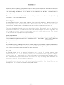 12
12 13
13 14
14 15
15 16
16 17
17 18
18 19
19 20
20 21
21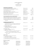 22
22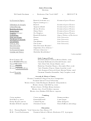 23
23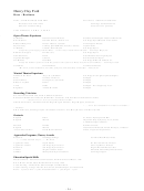 24
24 25
25 26
26 27
27 28
28 29
29 30
30 31
31 32
32 33
33 34
34 35
35 36
36 37
37 38
38 39
39 40
40 41
41