Math In Restaurants Worksheet With Answers Page 2
ADVERTISEMENT
 1
1 2
2 3
3 4
4 5
5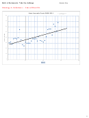 6
6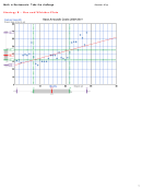 7
7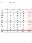 8
8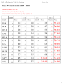 9
9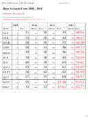 10
10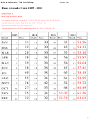 11
11Answer Key
Math in Restaurants: Take the challenge
3. Solve your problem in the space below and on the attached graph and chart, as needed.
Show all your steps. You can use the graph to find your line of best fit and the chart to
record additional values for the next 14 months.
•
Use a strategy for finding the line of best fit.
•
Once you have identified the line of best fit, calculate the equation of the line.
•
Make a prediction for the average cost of avocados for next year.
General Strategies and Solutions:
Students will use the Cost Chart and Graph (scatter plot) of the real world data and will see a
pattern with a somewhat linear correlation or trend line. Students need to decide on a strategy to
find a particular line that will show the general direction of the data. They will look at a line that
will appear to “fit” the data, called a “line of best fit” or “trend line” to make a prediction about the
average cost of the main ingredient in the next 14 months.
This will require them to identify the points, analyze the data, look for this linear relationship, make
a prediction about the average cost, and then determine the price using “Sue’s Rule of Thumb.”
How to find a “line of fit” using a variety of approaches:
• Visualize the line using a piece of spaghetti. A “line of best fit” is a line drawn on a scatter
plot to show the relationship between the two sets of data. You can estimate this line of fit
visually by drawing a “trend line” so that there are an approximately equal number of data points
above and below your line.
• Select two points on the line through which a “trend line” would fit.
o Find the slope (or rate of change) between the two points.
o Use the slope to write an equation for the line (either slope-intercept or point-slope
form).
• Box and Whisker Plots. Use the five-number summary, finding the two Q-points. (In a box
and whisker plot, Quartile 1 and 3-values form a rectangle, the Q-points are the vertices of this
rectangle.) Construct a diagonal line in the rectangle in the direction of the data trend. This will
be the line of best fit.
• To find the 5-number summary (min, Q1, median, Q3, and max) for the x-values and then
again for the y-values:
o Order the x-values from smallest to largest.
o Find the min(imum) (the smallest value) and the max(imum) (the largest value).
o Find the median, or the middle number in the entire ordered set.
o Find Q1, or the median of the numbers between the min and the median.
o Find Q3, or the median of the numbers between the median and the max.
o Repeat all of these steps for the y-values to determine the box and whisker plot for this
set of data.
• Use graphing technology. When we are able to draw a line of best fit, we are able to find the
correlation coefficient. It is a numerical measurement that measures the strength of a linear
relationship between two variables x, y.
2
ADVERTISEMENT
0 votes
Related Articles
Related forms


")


Related Categories
Parent category: Education