Deriving Relationships From Graphs Page 2
ADVERTISEMENT
 1
1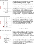 2
2Non-linear Relationships:
The graph to the left is a hyperbolic relationship. That is, the data
are not linear and both sets of values appear to approach
asymptotes. There are two approaches that one might use to find
the relationship between the variables pressure and volume. One
can perform a non-linear regression analysis to find the
relationship using a calculator or computer, or linearize the plot by
manipulating the data and re-plotting in an effort to create a linear
relationship between the manipulated variables. Looking at the
data carefully suggests that we have here an inverse relationship.
That is, when pressure is doubled, the volume is halved. The
relationship between the variables would seem to be of the form
pressure is inversely proportional to volume. Assuming for a
moment that this is the case, data for either pressure or volume can
be inverted (e.g., replace by 1/var) and the data re-graphed to see if
a linear relationship results. Replacing volume by 1/volume results in the graph below.
Linearized Plot of Above Data:
Here we see a linearized plot of the pressure-volume data used to
create the graph above. On the horizontal axis of the graph the
inverse of the volume has been plotted; pressure is plotted as
before on the vertical axis. A linear fit of the type y = mx + b is
now possible and shows that a linear relationship exists between
pressure and the inverse of the volume in this particular situation.
Note that the x-variable is identified with 1/volume, that the y-
variable is identified with 1/volume, and that b = 0. That is,
pressure = (3atm*lit)/volume
or
pressure * volume = 3atm*lit
The “Simpler, More Natural” Fit:
Students are sometimes tempted to use a polynomial function to
conduct a non-linear curve fit using calculators or computers (e.g.,
2
3
4
5
y = a + bx + cx
+ dx
+ ex
+ fx
+…). Such a function will fit
almost any data so long as the degree of the function is high
enough. What sometimes happens though (as did not happen in the
graph to the left) is that there will be wild migrations of the best-fit
curve between the data points that probably wouldn’t happen in
nature. Fortunately, Mother Nature is less complex than that, and
best fits involving trigonometric functions and the like can provide
th
simpler forms of relationship. Note the 4
order power function fit
of the graph to the left. A trigonometric function given by intensity
= (2.5lux)cos(θ) is a “simpler” representation of the data and a
“more natural” fit with the data. As a rule, simpler interpretations
are valued over more complex in science.
ADVERTISEMENT
0 votes
Related Articles
Related forms


Related Categories
Parent category: Business