Organizing Data Worksheet - Stats Tech Page 3
ADVERTISEMENT
 1
1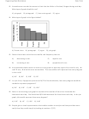 2
2 3
3 4
4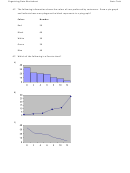 5
5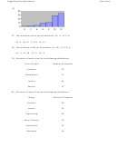 6
6Organizing Data Worksheet
Stats Tech
31. A time series graph represents data that occur over a specific period. (T/F)
32. A Pareto chart arranges data from largest to smallest according to frequencies. (T/F)
34. A pie graph would best represent the number of inches of rain that has fallen in Ohio each day
for the past 2 months. (T/F)
35. A pie graph was created showing the number of children per family. If 234 families were in the
survey and the section depicting families with three children represented 120°, the number of
families with three children was 78. (T/F)
37. The __________ is the number of times a value occurs in a data set.
42. The percentage of white, wheat, and rye bread sold at a supermarket each week is best shown
using a __________ graph.
43. A __________ would most appropriately represent the number of students that were enrolled
in Statistics for the past ten years.
45. A local fundraiser wants to graphically display the contributions they have received over the
past five years. Construct a time series graph for the following data.
Year
Contributions
1996
$550
1997
$700
1998
$800
1999
$1050
2000
$1200
ADVERTISEMENT
0 votes
Related Articles
Related forms


Related Categories
Parent category: Business