Statistics Worksheet - Relative Frequency Histogram Page 2
ADVERTISEMENT
 1
1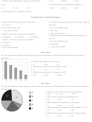 2
22. What is the cumulative frequency for the $30
a. $15
b. $30
c. $35
price?
4. Which price has the highest frequency?
a. 3
b. 16
c. 19
a. $10
b. $20
c. $25
3. Which price has a frequency of 2?
Introduction to Graphic Displays
1. Which is best for categorical variables?
4. Which plot does not display all of the values of
a. bar chart
the data?
b. box and whisker plot
a. box and whisker plot
c. stem and leaf plot
b. dot plot
c. stem and leaf plot
2. Which is best for categorical variables?
5. Which shows the quartiles and median most
a. histogram
b. pie chart
c. scatterplot
clearly?
3. Which is best for numerical variables?
a. box and whisker plot
a. bar chart
b. histogram
b. pie chart
c. stem and leaf plot
c. stem and leaf plot
Bar Chart
Use the chart below displaying the type of pet for 40 students in two third grade classes for questions 1
through 3.
1. How many students have a cat?
a. 8
b. 10
c. 13
2. How many students have a dog or a fish?
a. 8
b. 13
c. 21
3. Which type of pet has a frequency of 6?
a. bird
b. fish
c. other
Pie Chart
Use the chart below displaying the preferred choice of brand for 50 participants in a taste test for problems 1
through 5.
1. What percent of people preferred Brand E?
a. 16%
b. 24%
c. 32%
2. How many people preferred Brand C?
a. 10
b. 15
c. 20
3. Which brand is preferred by 16 people?
a. A
b. B
c. C
4. What percent of people preferred Brand A or D?
a. 16
b. 32
c. 48
5. Which brand is preferred by 8% of the people?
a. A
b. B
c. C
ADVERTISEMENT
0 votes
Related Articles
Related forms


Related Categories
Parent category: Education