Excel Pivot Tables And Charts (For Mac Users) Page 3
ADVERTISEMENT
 Printable pdf") 1
1 2
2 3
3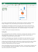 4
4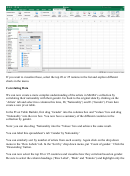 5
5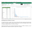 6
6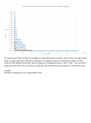 7
7Voila! You can now see how many women versus men are listed in MoMA’s artist data. Go
ahead and rename this tab to ‘Gender.’
You can also create a chart with this information. First select only the data you want charted.
Highlight the cells with the text ‘female’ and ‘male’ and their assigned values – four cells total.
Then click on the ‘Insert’ tab. The chart options allow you to select between columns, bars, lines
and scatter plots. Go ahead and try out different visualizations. You can also get a preview of
these options by selecting ‘Recommended Charts.’
ADVERTISEMENT
0 votes
Related Articles
Related forms


 For The Extended Summatimescale (stse) Chart")


Related Categories
Parent category: Education