Excel Pivot Tables And Charts (For Mac Users) Page 4
ADVERTISEMENT
 Printable pdf") 1
1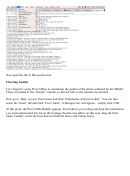 2
2 3
3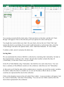 4
4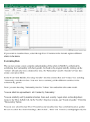 5
5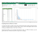 6
6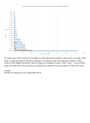 7
7You can play around with the chart styles. Click anywhere on the chart, and the tab ‘Chart
Design’ will appear. Click on the tab and you’ll see options for colors and layouts.
You might also want to label your chart. On your chart, click on the text ‘Chart Title’ and
rename the chart to your liking. If you want to add horizontal or vertical axis titles, click the
‘Chart Design’ tab and in the options below, click ‘Add Chart Elements’ à ‘Axis Titles’.
To delete a chart, select it and press the delete key.
Sorting Data
We can understand the artists in MoMA’s collection by examining their nationality. Go back to
the original data by clicking on the ‘Artists’ tab and select another column this time, D
(‘Nationality’). From here create a new pivot table.
In the Pivot Table Builder, drag ‘Nationality’ into both the rows and values boxes. You now
have a summary of the different countries in the collection. Label this new tab ‘Nationality’.
At this point you’ll find the data will be cumbersome to visualize, given all the country variables.
In order to reduce the data to a smaller set, we can sort the data so that it shows us which
countries are represented the most in the collection.
Click on the dropdown menu in the cell called ‘Row Labels’. A pop up window will appear. Sort
by ‘count of nationality’ and select ‘Descending’. You can now see which countries have the
most artists represented in the collection.
ADVERTISEMENT
0 votes
Related Articles
Related forms


 For The Extended Summatimescale (stse) Chart")


Related Categories
Parent category: Education