Data Display Worksheets - Spectrum Math, Grade 7 Page 7
ADVERTISEMENT
 1
1 2
2 3
3 4
4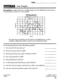 5
5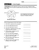 6
6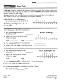 7
7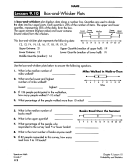 8
8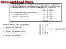 9
9 10
10NAME ______________________ _
Lesson 9.9
line
Plots
A
line plot
is a graph that shows the frequency of data
on
a number line. Line plots make it easy
to identify the
mode, range,
and any outliers in a data
set.
Outliers
are data points
that
are much
larger or smaller than other
values.
To make a line
plot,
draw a number line from the least to the greatest value in the number set.
Then,
make an x above each number every time it appears in the set.
Make a line plot for the following data:
8, 9,
II,
8, 10,
II,
8, 9,
12, 8,
17,
12
The mode is
8.
The range is
17
-
8
=
9.
17
is an
ourlier.
Answer the questions about the line plots below.
I. How many people responded to
the sibling survey?
2.
What is the mode of the sibling survey?
What is the range?
mode:
range:
3.
How many people have 3 or more siblings?
II.
What number is an outlier on the sibling survey?
5.
How many people responded to the
test survey?
6.
What is the mode of the test survey?
What is
the
range?
mode:
range:
7.
How many people studied 2
or
fewer hours?
8.
How many people studied
lf
or
more
hours?
·
X
X
X
X
X
X
X
X
X
X
X
X
7
8
9
1
0
I
I
12
13
l
lf
15
16
17
18
X
X
X
X
X
X
X
II(
I
0
Number of Siblings
X
X
X
X
X
X
X
X
I
I
I
I
I
I
I
I
2
3
If
5
6
7
8
9
Hours Studying For Test
X
X X
X
X
X
X
X X X
X X
X X
X X
X X X
I
2
1 ..
10
9.
Did more people study
2
or more hours or less than
2
hours?
More people studied
hours.
Spectrum Math
Grade
7
Chapter
9,
lesson 9
Probability and Statistics
I I I
ADVERTISEMENT
0 votes
Related Articles
Related forms


Related Categories
Parent category: Education