Email Sig Guide Page 2
ADVERTISEMENT
 1
1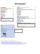 2
2Bad Examples
Too many colors, different fonts
and too much information
Way too much information, you don’t need to list
every single way someone can contact you. Also try
to avoid using quotes.
No graphics! Font is
difficult to read.
Looking for more tips check out the following
ADVERTISEMENT
0 votes
Related Articles
Related forms


Related Categories
Parent category: Business