Bar Charts And Pie Charts Worksheet Page 3
ADVERTISEMENT
 1
1 2
2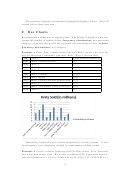 3
3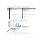 4
4 5
5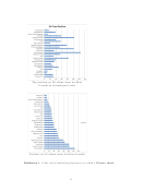 6
6 7
7 8
8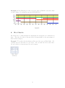 9
9 10
10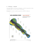 11
11 12
12 13
13The previous examples are informative graphical displays of data. They all
started life as bland data sets.
2
Bar Charts
Bar charts are a visual way to organize data. The height or length of a bar rep-
resents the number of points of data (frequency distribution) in a particular
category. One can also let the bar represent the percentage of data (relative
frequency distribution) in a category.
Example 1 From ( ) consider the sales …g-
ures for Microsoft’ s videogame franchise, Halo. Here is the raw data.
Year
Game
Units Sold (in millions)
2001
Halo: Combat Evolved
5.5
2004
Halo 2
8
2007
Halo 3
12.06
2009
Halo Wars
2.54
2009
Halo 3: ODST
6.32
2010
Halo: Reach
9.76
2011
Halo: Combat Evolved Anniversary
2.37
2012
Halo 4
9.52
2014
Halo: The Master Chief Collection
2.61
2015
Halo 5
5
Let’ s construct a bar chart based on units sold.
Translating frequencies into relative frequencies is an easy process. A rela-
tive frequency is the frequency divided by total number of data points.
Example 2 Create a relative frequency chart for Halo games. First, determine
how many data points exist. We do this by adding all the frequencies together.
sum of all frequencies = 5:5+8+12:06+2:54+6:32+9:76+2:37+9:52+2:61+5 =
3
ADVERTISEMENT
0 votes
Related Articles
Related forms


Related Categories
Parent category: Education