Bar Charts And Pie Charts Worksheet Page 9
ADVERTISEMENT
 1
1 2
2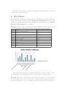 3
3 4
4 5
5 6
6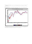 7
7 8
8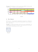 9
9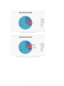 10
10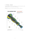 11
11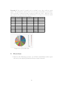 12
12 13
13Example 6 The following is a time series for colors of M&M’ s used from 1940
to 2010 ( ).
3
Pie Charts
Pie charts are a visual method for displaying the categories of a collection of
data. The size of a slice of the pie chart is proportional to the percentage of
data in that category.
Example 7 Consider the distribution of hits over the career of Babe Ruth. We
visually represent this data in a pie chart. We can label the slices with either
the raw numbers of percentages for each category
Babe Ruth At Bats
Single
1517
Double
506
Triple
136
HR
714
Out
5526
Babe Ruth
Statistics
9
ADVERTISEMENT
0 votes
Related Articles
Related forms


Related Categories
Parent category: Education