2.1 Tally Charts And Frequency Tables Worksheet Page 17
ADVERTISEMENT
 1
1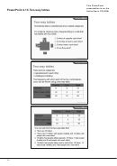 2
2 3
3 4
4 5
5 6
6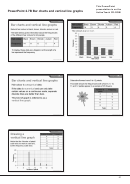 7
7 8
8 9
9 10
10 11
11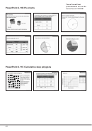 12
12 13
13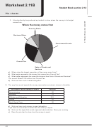 14
14 15
15 16
16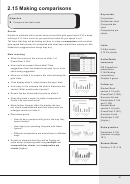 17
17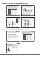 18
18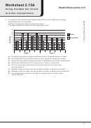 19
19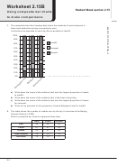 20
20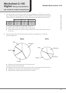 21
21 22
22 23
23 24
24 25
25 26
26 27
272.15 Making comparisons
Key words
Objective
Comparison
Multiple bar chart
●
Compare two data sets
Composite bar
chart
Comparative pie
Starter
charts
Explain to students that a recent survey found that girls spent about £13 a week
and boys £11. How much do you spend and what do you spend it on?
Tell them that they will be finding out how to make a comparison such as what
girls spend their money on compared with what boys spend their money on. Ask
Links
students to suggest some things they buy.
2.9 Bar charts
2.12 Pie charts
Main teaching
●
Show the results of the survey on slide 1 of
ActiveTeach
PowerPoint 2.15A.
resources
●
How could we present these data? Take
MS PowerPoint
suggestions from the students and pick up on a bar
presentation
chart being suggested.
2.15A Making
●
comparisons
Move on to slide 2 to reveal a bar chart showing the
Chapter 2 game
girls’ data.
●
Then display slide 3, which shows the boys’ data.
Follow up
●
How easy is it to compare the data in these two bar
Student Book
charts? What would make it easier?
section 2.15 (with
●
Reveal the bar charts side by side on slide 4.
PowerPoint 2.15B),
Exercise 2H and
●
Does this make it easier to make comparisons?
Worksheets 2.15A
Could it be improved more?
and 2.15B
●
Move further through slide 4 to display the two
Student Book
bar charts superimposed and then move onto the
section 2.16 (with
enlarged version on slide 5.
PowerPoint 2.15C),
Exercise 2I and
●
Discussion points
Worksheet 2.15C
○
How do boys compare with girls in the way they
(Higher)
spend money?
○
How does your spending compare with these
Extra practice
figures?
Worksheet 2.15A
○
Different comparisons are best shown in different
(answers on page
ways.
181)
●
Explain to students that they will be finding out
more about comparing data using multiple and
Student Book
composite bar charts, and comparative pie
Sections 2.15–2.16
charts (Higher).
51
ADVERTISEMENT
0 votes
Related Articles
Related forms


 - 1ma0 Frequency Tables Worksheet - Edexcel Gcse")


Related Categories
Parent category: Education