Scatter Plot, Correlation, And Line Of Best Fit Exam With Answer Key - High School Common Core: Interpret Linear Models Page 10
ADVERTISEMENT
 1
1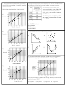 2
2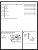 3
3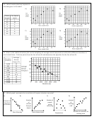 4
4 5
5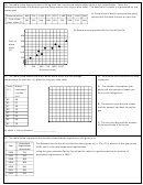 6
6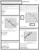 7
7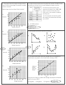 8
8 9
9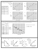 10
10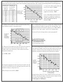 11
11 12
1213. Which scatter plot best represents
the data given in the table?
A)
B)
Flame
Fire Speed
Length
(mph)
10
2
40
10
15
5
5
3
55
9
C)
D)
30
8
25
6
14. Given in the table and scatter plot are the samplings of average annual temperatures collected at different elevations in
the United States. Pick two points from the line of best fit and determine the equation for the line of best fit.
Average
Elevation
Annual
Something close to the equation
(meters)
Temp (C)
1,000
15
y = -0.0062x + 23.34
490
20
2,200
8
650
17
1,750
8
1,500
12.5
800
18
1,400
15
2,000
10
1,200
12
15. Which graph represents the correlation of its given situation correctly?
A)
B)
C)
D)
Number
Amount
Number of
Amount of
of
of
people
dog food
clothing
tourists
going
purchased
sold
flying to
swimming
Hawaii
Number of customers at
Size of the dog
Cost of plane ticket
Temperature
clothing store
ADVERTISEMENT
0 votes
Related Articles
Related forms


Related Categories
Parent category: Education