Scatter Plot, Correlation, And Line Of Best Fit Exam With Answer Key - High School Common Core: Interpret Linear Models Page 12
ADVERTISEMENT
 1
1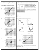 2
2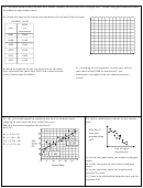 3
3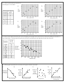 4
4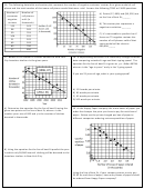 5
5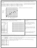 6
6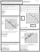 7
7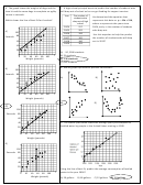 8
8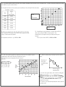 9
9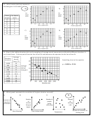 10
10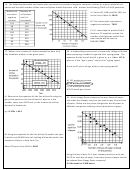 11
11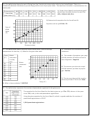 12
1220. The table below shows the cost of flying from San Francisco to various other cities in the United States. There is a
relationship between the distance you are flying and the cost of your plan ticket. The data from the table is represented on the
scatter plot.
A) Draw a line of best fit and pick two good
Distance(miles) 600 374 1,240 725 150 1,100 950 1,500 500
points from the table that are on your line:
Cost of the
(374, 125) & (1100, 224)
143 125
200
180 110
224
180
250
164
plane ticket ($)
B) Determine the equation for the line of best fit.
300
Equation such as y =0.136x + 74
Cost of
250
plane
200
ticket
($)
150
100
0
250
500 750 1000 1250
Distance (miles)
21. The table below shows how much water Nuria drinks and the average
22. Determine the correlation for each
temperature for that day. A) Make for the given data table.
statement.
A) The number of people at your party
Temp
Water
and the number of sodas you have in
consumed
(F)
the refrigerator. Negative
50
in a day
(oz)
Water
40
99
48
consumed
85
27
30
(oz)
B) The amount your drive to school
97
48
and the amount you have to pay for
80
16
20
gas. Positive
92
32
10
88
34
94
40
C) The size your dog and the number
0
80
85
90
95
100
83
20
of times you take it to the vet. None
Temp (F)
B) What is the correlation? POSITIVE
23. The table below represents the number of powerboats registered in the given year.
The equation for the line of best for this data is given as y = 27x + 751, where x is the years
Powerboat
Year
Registrations
since 1996, and y is the total powerboat registrations.
(thousands)
Using the given equation for the line of best fit, which is a good prediction for number of
1996
751
powerboat registrations in 2015?
1997
797
1998
806
1,264 powerboat registrations
1999
805
2000
841
2001
903
2002
923
ADVERTISEMENT
0 votes
Related Articles
Related forms


Related Categories
Parent category: Education