Scatter Plot, Correlation, And Line Of Best Fit Exam With Answer Key - High School Common Core: Interpret Linear Models Page 9
ADVERTISEMENT
 1
1 2
2 3
3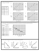 4
4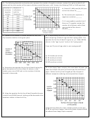 5
5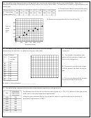 6
6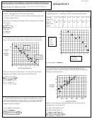 7
7 8
8 9
9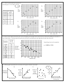 10
10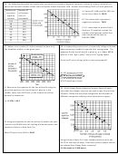 11
11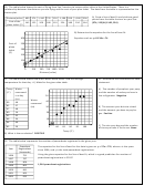 12
1210. The table below shows the sales for a flower company for the years 2007 through 2012. Answer the given questions about
this table on your answer sheet.
A) Graph the data on the scatter plot and draw a line of best fit for the data.
FLOWER SALES
400
Sales
Year
(in
375
thousands)
Sales
(in
350
2007
$305
thousands)
2008
$330
325
2009
$345
300
2010
$370
2007 2008 2009 2010 2011 2012
2011
$395
Year
2012
$420
C) According to your equation, in what year will the
B) Write an equation for the line of best fit for this data.
sales reach about $500 (in thousands)? Use
Let x represent the years since 2007 and y represent the
mathematics to explain how you determined your
sales, in thousands of dollars.
answer.
An equation similar to y = 22.7x + 304
8 or 9 years from 2007 or 2015 or 2016
11. Mr. Van made a graph to represent the time his students spent
12. Which relationship is shown by this scatter
studying for their test and their actual test score.
plot?
Which is the correct equation for the line of
best fit?
Number of
new gym
A) y = 1.4x + 55
memberships
B) y = 1.4x – 84
sold
C) y = 0.72x + 60
D) y = 0.72 + 56
Cost of a gym
membership
A) As the cost goes down, the number sold goes
down.
B) As the cost goes up, the number sold goes
down.
C) As the cost does down, the number sold
remains the same.
D) There is no relationship between cost and the
number sold.
ADVERTISEMENT
0 votes
Related Articles
Related forms


Related Categories
Parent category: Education