Supply And Demand - Chapter 3 Page 8
ADVERTISEMENT
 1
1 2
2 3
3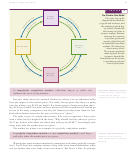 4
4 5
5 6
6 7
7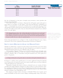 8
8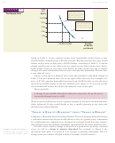 9
9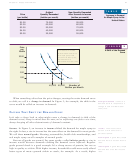 10
10 11
11 12
12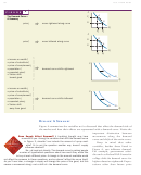 13
13 14
14 15
15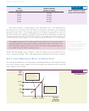 16
16 17
17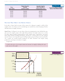 18
18 19
19 20
20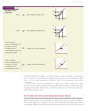 21
21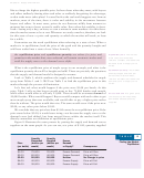 22
22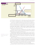 23
23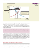 24
24 25
25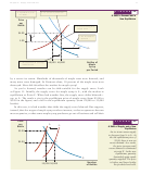 26
26 27
27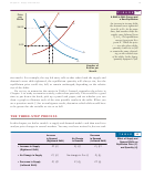 28
28 29
29 30
30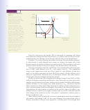 31
31 32
32 33
33 34
34 35
35 36
36 37
37Chapter 3: Supply and Demand
59
T A B L E
1
Price
Quantity Demanded
(per bottle)
(bottles per month)
Demand Schedule for Maple
Syrup in the United States
$1.00
75,000
$2.00
60,000
$3.00
50,000
$4.00
40,000
$5.00
35,000
the law of demand: As the price of maple syrup increases, ceteris paribus, the
quantity demanded falls.
Now look at Figure 2. It shows a diagram that will appear again and again in
your study of economics. In the figure, each price-and-quantity combination in
Table 1 is represented by a point. For example, point A represents the price $4.00
and quantity 40,000, while point B represents the pair $2.00 and 60,000. When we
connect all of these points with a line, we obtain the famous demand curve, labeled
with a D in the figure.
The demand curve shows the relationship between the price of a good and
Demand curve
The graphical
the quantity demanded in the market, holding constant all other variables
depiction of a demand schedule;
a curve showing the quantity of
that influence demand. Each point on the curve shows the total quantity that
a good or service demanded at
buyers would choose to buy at a specific price.
various prices, with all other
variables held constant.
Notice that the demand curve in Figure 2—like virtually all demand curves—slopes
downward. This is just a graphical representation of the law of demand.
S
M
A
D
C
HIFTS VERSUS
OVEMENTS
LONG THE
EMAND
URVE
Markets are affected by a variety of events. Some events will cause us to move along
the demand curve; others will cause the entire demand curve to shift. It is crucial to
distinguish between these two very different types of effects.
Let’s go back to Figure 2. There, you can see that when the price of maple syrup
rises from $2.00 to $4.00 per bottle, the number of bottles demanded falls from
60,000 to 40,000. This is a movement along the demand curve, from point B to
point A. In general,
a change in the price of a good causes a movement along the demand curve.
In Figure 2, a fall in price would cause us to move rightward along the demand
curve (from point A to point B), and a rise in price would cause us to move leftward
along the demand curve (from B to A).
Remember, though, that when we draw a demand curve, we assume all other
variables that might influence demand are held constant at some particular value.
For example, the demand curve in Figure 2 might have been drawn to give us quan-
tity demanded at each price when average household income in the United States
remains constant at, say, $40,000 per year.
But suppose average income increases to $50,000? With more income, we’d
expect households to buy more of most things, including maple syrup. This is illus-
ADVERTISEMENT
0 votes
Related Articles
Related forms


Related Categories
Parent category: Education