What-If Analysis, Charting, And Working With Large Worksheets Page 34
ADVERTISEMENT
 1
1 2
2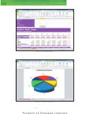 3
3 4
4 5
5 6
6 7
7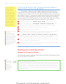 8
8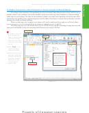 9
9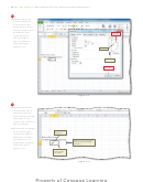 10
10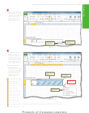 11
11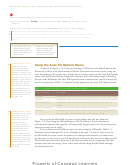 12
12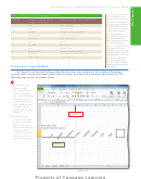 13
13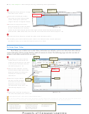 14
14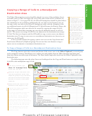 15
15 16
16 17
17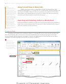 18
18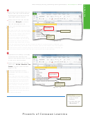 19
19 20
20 21
21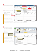 22
22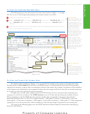 23
23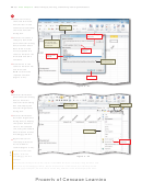 24
24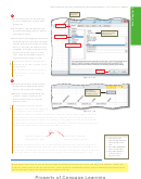 25
25 26
26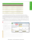 27
27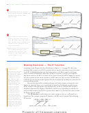 28
28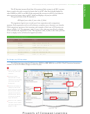 29
29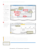 30
30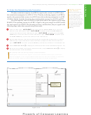 31
31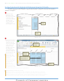 32
32 33
33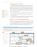 34
34 35
35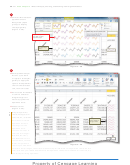 36
36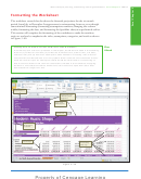 37
37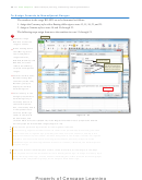 38
38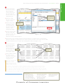 39
39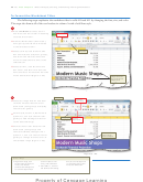 40
40 41
41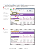 42
42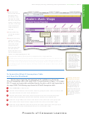 43
43 44
44 45
45 46
46 47
47 48
48 49
49 50
50 51
51 52
52 53
53 54
54 55
55 56
56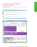 57
57 58
58 59
59 60
60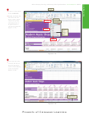 61
61 62
62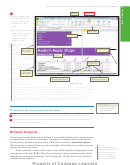 63
63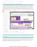 64
64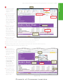 65
65 66
66 67
67 68
68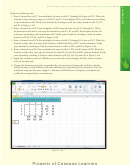 69
69 70
70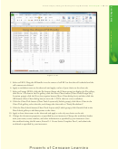 71
71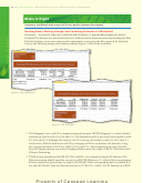 72
72 73
73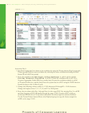 74
74 75
75 76
76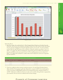 77
77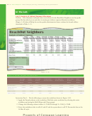 78
78 79
79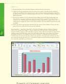 80
80 81
81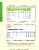 82
82 83
83 84
84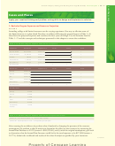 85
85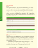 86
86 87
87EX 170
Excel Chapter 3
What-If Analysis, Charting, and Working with Large Worksheets
Nested Forms of the IF Function
A nested IF function is one in which the action to be taken for the true or false
case includes yet another IF function. The second IF function is considered to be nested,
or layered, within the fi rst. Study the nested IF function below, which determines the
eligibility of a student to go on a fi eld trip. The school permits the student to attend the
fi eld trip if the student’s age is at least 14 and the student has provided a signed permis-
sion form. Assume the following in this example: (1) the nested IF function is assigned
to cell L9, which instructs Excel to display one of three messages in the cell; (2) cell L7
Using IFERROR
contains a student’s age; and (3) cell L8 contains a Y or N, based on whether the person
Similar to the IF function,
the IFERROR function
provided a signed permission form.
checks a formula for
=IF(L7>=14, IF(L8="Y","Allowed","Can Travel, but No Permission"),"Too Young to Travel")
correctness. For example,
=IFERROR(formula, “Error
The nested IF function instructs Excel to display one, and only one, of the
Message”) examines the
following three messages in cell L9: (1) Allowed; or (2) Can Travel, but No Permission;
formula argument. If an
error appears (such as
or (3) Too Young to Travel.
#N/A), Excel displays the
You can nest IF functions as deep as you want, but after you get beyond a nest of
Error Message text in the
three IF functions, the logic becomes diffi cult to follow and alternative solutions, such as
cell instead of the Excel
the use of multiple cells and simple IF functions, should be considered.
#N/A error.
Adding and Formatting Sparkline Charts
Sometimes you may want to condense a range of data into a small chart in order to show
a trend or variation in the range. Excel’s standard charts may be too large or extensive for
your needs. An Excel Sparkline chart provides a simple way to show trends and variations
in a range of data within a single cell. Excel includes three types of Sparkline charts: Line,
Column, and Win/Loss. Because they exist in only one cell, you should use Sparkline
charts to convey succinct, eye-catching summaries of the data they represent.
To Add a Sparkline Chart to the Worksheet
Each of the rows of monthly data, including those containing formulas, provides useful information easily
summarized by a Line Sparkline chart. A Line Sparkline chart is a good choice because it shows trends over the
six-month period for each row of data.
The following steps add a Line Sparkline chart to cell I13 and then use the fi ll handle to create Line Sparkline
charts in the range I14:I25 that represent the monthly data in rows 13 through 25.
1
Line button
Insert tab
•
Scroll the worksheet
so that both columns B
and I are displayed on
the screen.
Sparklines group
•
Select cell I13 to
Create Sparklines
prepare to insert a
dialog box
Sparkline chart in
the cell.
Data Range box
•
Display the Insert
Collapse Dialog
tab and then click
Box button
Line (Insert tab |
Sparklines group) to
Cell I13 selected
display the Create
Cell I13 is default location
for Sparkline chart
Sparklines dialog box
(Figure 3 –35).
Figure 3–35
ADVERTISEMENT
0 votes
Related Articles
Related forms


Related Categories
Parent category: Education