What-If Analysis, Charting, And Working With Large Worksheets Page 44
ADVERTISEMENT
 1
1 2
2 3
3 4
4 5
5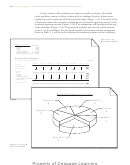 6
6 7
7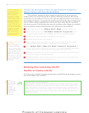 8
8 9
9 10
10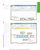 11
11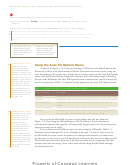 12
12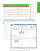 13
13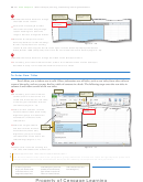 14
14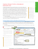 15
15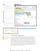 16
16 17
17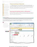 18
18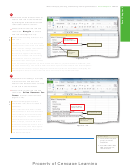 19
19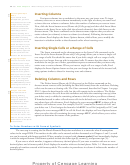 20
20 21
21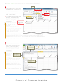 22
22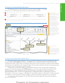 23
23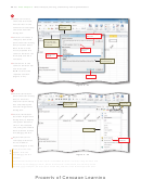 24
24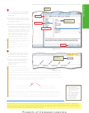 25
25 26
26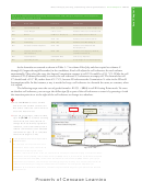 27
27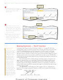 28
28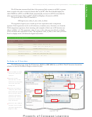 29
29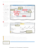 30
30 31
31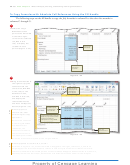 32
32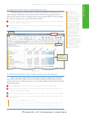 33
33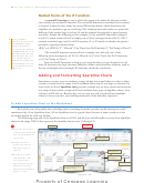 34
34 35
35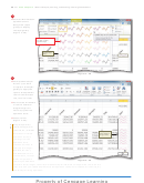 36
36 37
37 38
38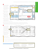 39
39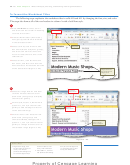 40
40 41
41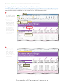 42
42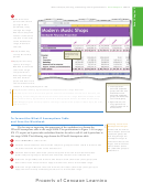 43
43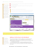 44
44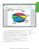 45
45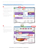 46
46 47
47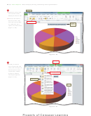 48
48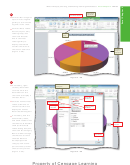 49
49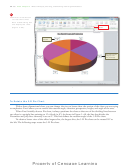 50
50 51
51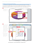 52
52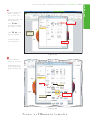 53
53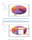 54
54 55
55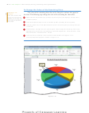 56
56 57
57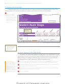 58
58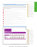 59
59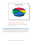 60
60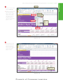 61
61 62
62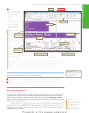 63
63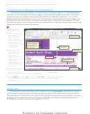 64
64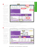 65
65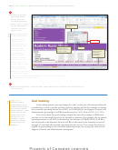 66
66 67
67 68
68 69
69 70
70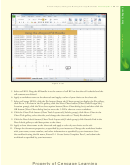 71
71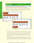 72
72 73
73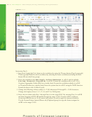 74
74 75
75 76
76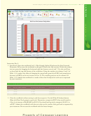 77
77 78
78 79
79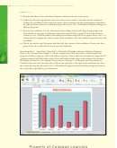 80
80 81
81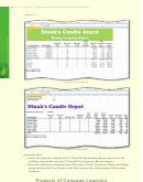 82
82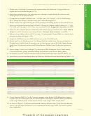 83
83 84
84 85
85 86
86 87
87EX 180
Excel Chapter 3
What-If Analysis, Charting, and Working with Large Worksheets
6
Selecting Nonadjacent
Click the Font Color button (Home tab | Font group) to apply the most recently used font
Ranges
color to the selected range.
One of the more diffi cult
7
tasks to learn is selecting
Click cell D8 to deselect the range A2:B8 and display the What-If Assumptions table, as
nonadjacent ranges. To
shown in Figure 3 –50.
complete this task, do
8
not hold down the
CTRL
Save the workbook.
key when you select the
fi rst range because Excel
What happens when I click the Italic and Underline buttons?
will consider the current
active cell to be the fi rst
Recall that when you assign the italic font style to a cell, Excel slants the characters slightly
selection, and you may not
to the right, as shown in cell A1 in Figure 3 – 50. The underline format underlines only the
want the current active
characters in the cell, rather than the entire cell, as is the case when you assign a cell a
cell in the selection. Once
bottom border.
the fi rst range is selected,
hold down the
key
CTRL
and drag through the
nonadjacent ranges. If a
desired range is not visible
in the window, use the
Italic button
scroll arrows to view the
Underline button
range. You need not hold
down the
key while
CTRL
you scroll.
14-point italic
underlined font
8-point font
Figure 3 –50
Break Point:
If you wish to stop working through the chapter at this point, you can quit Excel now and then resume the
project at a later point in time by starting Excel, opening the fi le called Modern Music Shops Six-Month Financial Projection,
and continuing to follow the steps from this location forward.
Adding a 3-D Pie Chart to the Workbook
Charts
When you change a
value on which a chart
The next step in the chapter is to draw the 3-D Pie chart on a separate sheet in the
is dependent, Excel
workbook, as shown in Figure 3 –51. Use a pie chart to show the relationship or
immediately redraws the
proportion of parts to a whole. Each slice (or wedge) of the pie shows what percent that
chart based on the new
slice contributes to the total (100%).
value. With bar charts,
you can drag the bar in
The 3-D Pie chart in Figure 3– 51 shows the contribution of each month’s
the chart in one direction
projected operating income to the six-month projected operating income. The 3-D
or another to change the
Pie chart makes it easy to evaluate the contribution of one month in comparison to the
corresponding value in the
other months.
worksheet.
ADVERTISEMENT
0 votes
Related Articles
Related forms


Related Categories
Parent category: Education