What-If Analysis, Charting, And Working With Large Worksheets Page 45
ADVERTISEMENT
 1
1 2
2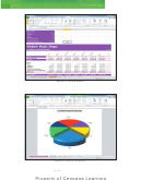 3
3 4
4 5
5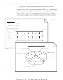 6
6 7
7 8
8 9
9 10
10 11
11 12
12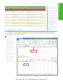 13
13 14
14 15
15 16
16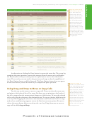 17
17 18
18 19
19 20
20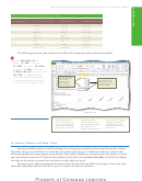 21
21 22
22 23
23 24
24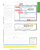 25
25 26
26 27
27 28
28 29
29 30
30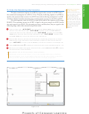 31
31 32
32 33
33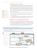 34
34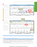 35
35 36
36 37
37 38
38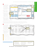 39
39 40
40 41
41 42
42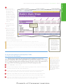 43
43 44
44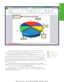 45
45 46
46 47
47 48
48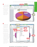 49
49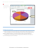 50
50 51
51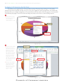 52
52 53
53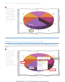 54
54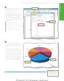 55
55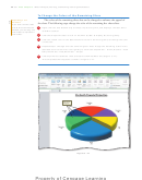 56
56 57
57 58
58 59
59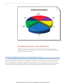 60
60 61
61 62
62 63
63 64
64 65
65 66
66 67
67 68
68 69
69 70
70 71
71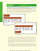 72
72 73
73 74
74 75
75 76
76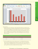 77
77 78
78 79
79 80
80 81
81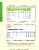 82
82 83
83 84
84 85
85 86
86 87
87What-If Analysis, Charting, and Working with Large Worksheets
Excel Chapter 3
EX 181
chart title underlined
and font size changed
to 28-point
3-D Pie chart
default color of
slices changed
data labels
changed to
month and
percentage
exploded slice
Figure 3 –51
Unlike the 3-D Column chart created in Chapter 1, the 3-D Pie chart shown
Chart Items
When you rest the mouse
in Figure 3 –51 is not embedded in the worksheet. Instead, the Pie chart resides on a
pointer over a chart item,
separate sheet, called a chart sheet, which contains only the chart.
such as a legend, bar, or
In this worksheet, the ranges to chart are the nonadjacent ranges B12:G12 (month
axis, Excel displays a chart
names) and B25:G25 (monthly operating incomes). The month names in the range
tip containing the name of
the item.
B12:G12 will identify the slices of the Pie chart; these entries are called category names.
The range B25:G25 contains the data that determines the size of the slices in the pie;
these entries are called the data series. Because six months are being charted, the 3-D Pie
chart contains six slices.
The sketch of the 3-D Pie chart in Figure 3– 3b on page EX 142 also calls for
emphasizing the month of August by offsetting its slice from the main portion. A Pie chart
with one or more slices offset is called an exploded Pie chart.
As shown in Figure 3 –51, the default 3-D Pie chart also has been enhanced by
rotating it, changing the colors of the slices, adding a bevel, and modifying the chart title
and labels that identify the slices.
ADVERTISEMENT
0 votes
Related Articles
Related forms


Related Categories
Parent category: Education